A White Wall Is Not Minimal — It’s Unfinished
True minimalism is highly curated. A white wall in a home that hasn’t addressed it isn’t a design statement — it’s an avoidance. A thoughtfully composed gallery wall tells the story of the person who lives there: what moves them, where they’ve been, what they consider beautiful. This is the most personal form of interior design.
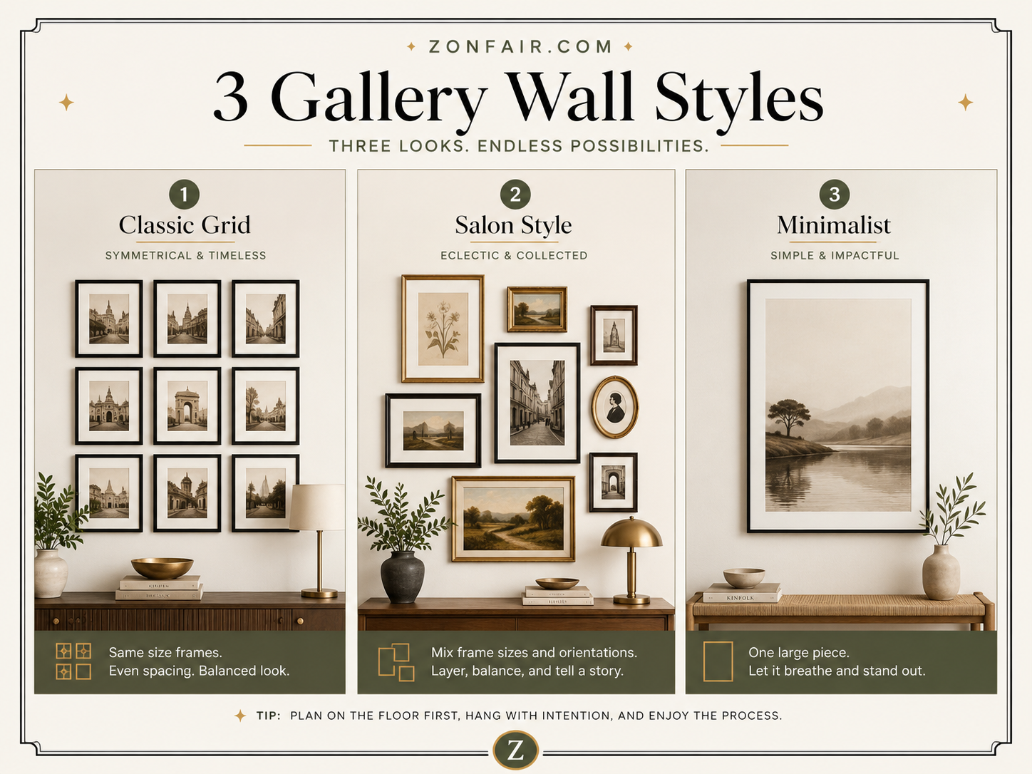
The Three Gallery Wall Styles — Know Which Is You
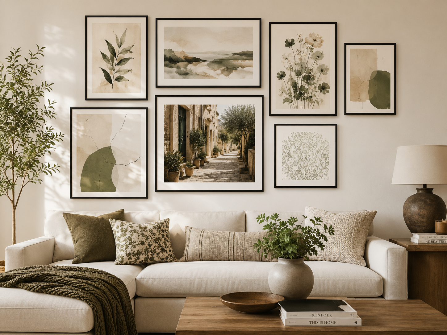
Salon Style: the classic European approach — mixed frame sizes, mixed subject matter, arranged organically. Emotional, layered, personal. Grid / Symmetry: identical frames in a geometric layout. Controlled, modern, satisfying. Single Statement: one very large piece as the entire focal wall. Bold, confident, sophisticated. None is better. All are valid. The wrong one is the one that doesn’t reflect you.
Sizing Rules That Prevent Expensive Mistakes
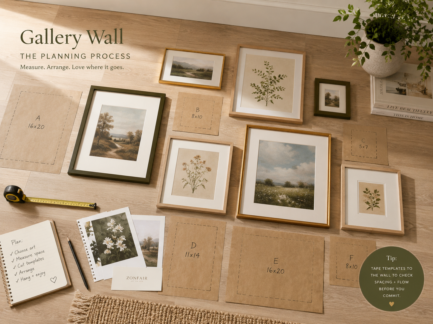
Your primary artwork should span approximately two-thirds of the furniture below it — not less (looks orphaned), not more (overwhelming). For a gallery grouping, the visual center of the entire arrangement should sit at 57 inches from the floor — standard museum and gallery hanging height. Plan on the floor before committing a single nail.
The Zonfair Art Collection — A Genuinely Curated Starting Point
The Art Stock Photos collection at zonfair.com/art-stock-photos/ spans multiple aesthetic languages: Watercolor Landscape Art, Sacred Light Art, Modern Luxury Metal Art, Abstract Expressionist Art, Famous Classical Mythology Art. These aren’t generic prints — they’re carefully licensed images with genuine artistic value. Print at your preferred size, frame to match your space.
Beyond Prints — What to Mix Into a Gallery Wall
The most interesting gallery walls always include texture variation. Consider: a small circular mirror (reflects light, creates depth). A wall-mounted ceramic piece. A floating shelf with a single meaningful object. A textile — woven, macramé, or embroidered. These additions move a gallery wall from ‘art display’ to ‘environment.’